The logo of CLeDi Erasmus+ project is the result of a bottom-up process, being developed by Italian students under the supervision of Fondazione Luigi Clerici. The foundational idea was that of a logo design able to express both astrophysics and an inclusive environment.
The students’ idea for the logo came out of the “Italian Language and Literarure” classes on the origin of Italian vernacular language. In relation to the origin of Italian vernacular, Frederick II (1194-1250) – the Emperor of the Holy Roman Empire joining Germany and Sicily under his reign – was a prominent figure.

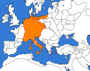
Frederick II had many different interests and deep refined knowledge. At his court, in Palermo, he used to host not only the poets who shaped the Italian vernacular poetry – the so called Scuola Siciliana – but also scientists and scholars from different cultural backgrounds.
He aimed to establish peace between Christians and Muslims in the Holy Land. To this end, he led a Crusade to Jerusalem where he came to a diplomatic solution with the Sultan of Egypt; thus avoiding resort to weapons. The diplomatic solution attracted harsh criticism from the parties closer to the Pope and earned Frederick II the appellative of Antichrist.
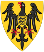
The emblem of the Swebian household – to which Frederick II belonged – was an eagle. Since both Frederick II and CLeDi project aimed at an inclusive environment, it came out the idea of considering the eagle as a symbol for CLeDi project.
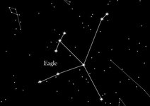
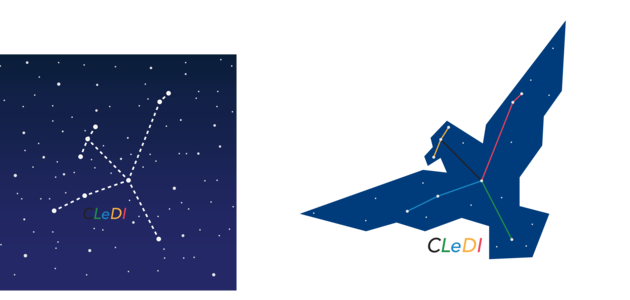
The eagle as a symbol is also connected to astronomy, namely to the Eagle Constellation.
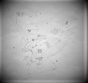
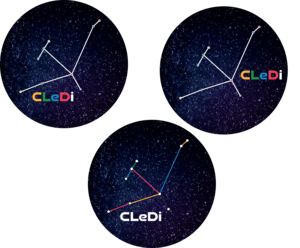
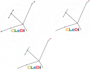
The first draft of the logo consisted in the image of an eagle. This image was however considered too detailed compared to the technical requirements of a logo, while the eagle seemed too aggressive compared to the general theme of the project and the flags too small and quite irrelevant to the project topic. Therefore, the picture of the eagle was made more essential and the students decided to focus on the shape of the Eagle Constellation. As for the need to highlight the idea of integration, the students took inspiration from the Olympic rings and chose to link the stars with lines in the colours of the five continents.
Finally, the draft on paper was designed in vector. Here bellow the different versions produced before the definition of the official CLeDi logo.
 This project has been funded with support from the European Commission. This website reflects the views only of the author, and the Commission cannot be held responsible for any use which may be made of the information contained therein.